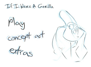
So today I scanned in my concept work for the 2D section of our DVD, as I had previously taken photo's and the quality was terrible. We soon noticed the difference and decided to have another go at the menu today, this time sticking with our original sketch idea. We bunged our favourite concept sketch of William on the canvas and knew straight away it was going to work. I wanted to have a sketchy font style off the net and Alec agreed but added the finishing touch by doubling up the text layers, changing them to the light blue pencil coulour I had used for my construction lines on William, lower the opacity, angle them, and add a awind filter to get the grainy crayon effect. It looks AWESOME. Simple is always best. We accomplished this is about 20 mins apposed to the 2 hours yesterday! Now to actually make the DVD!....

Note: the quality and colour has been lost on this blog upload, however the actual Menu is much better.

No comments:
Post a Comment